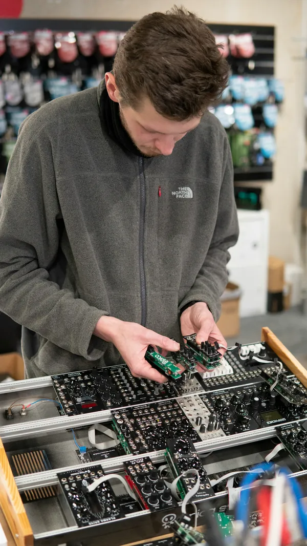
A knob makes a particular invitation. Its edge is there to be held, and the small mark on its face gives your eye something to follow. Before reading a label, you can usually make a reasonable guess about the movement the object expects. A switch offers a different gesture. A flat button asks for another. These ordinary distinctions give physical controls a useful vocabulary before any words have been added.
That vocabulary is enjoyable to look at, but it also has a job. Someone approaching an unfamiliar panel needs to connect a control with the thing it changes. A label helps. So does its position beside a display or a visible part of the object. A panel that makes these relationships clear lets the user begin with a question about their own task, instead of a question about how the panel is organized.
What the hand can see
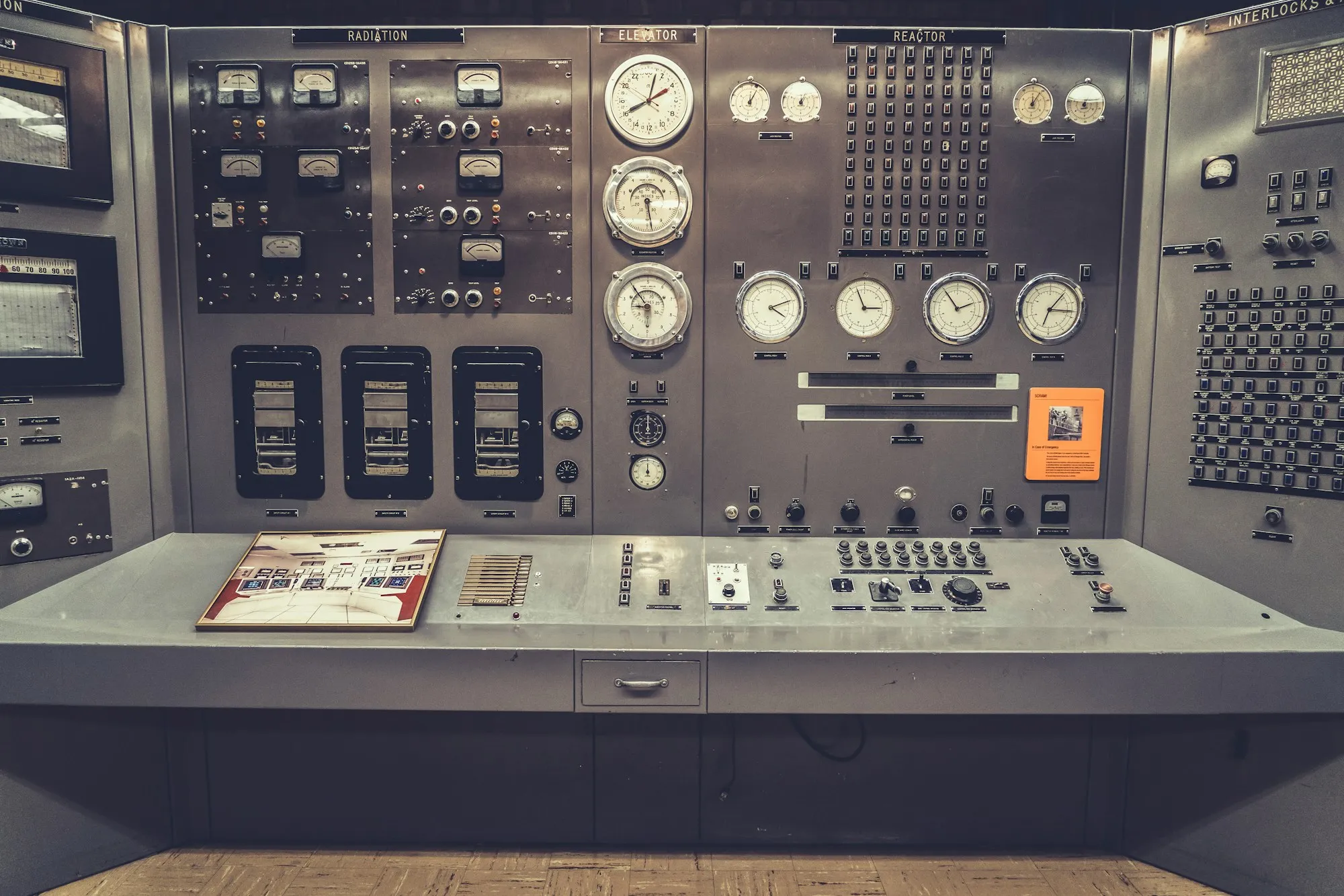
Consider a row of identical buttons. From a distance the repetition can look composed. At close range, the person using them may have to read every label before choosing. A little variation can give the row a structure: a gap between groups, a different shape for the main action, or a position at the end for the control used least often. Each difference should correspond to something someone needs to distinguish.
Variation without a reason can be just as confusing. If neighboring controls look unrelated despite doing similar jobs, their appearance stops helping. The panel becomes a collection of small puzzles. The useful question is whether a visible difference predicts a difference in use. When it does, someone can learn the object through a few successful encounters and recognize the relevant part again.
There is pleasure in a control that gives the hand a clear place to go. A small recess around a button separates it from the surface. A raised edge gives a knob a grip. These details can be modest. They still make the difference between an object that presents its controls clearly and one whose controls have to be searched for across an otherwise uninterrupted face.
A control is easier to understand when its shape, position, and response tell the same story. The hand knows where to go, the eye can connect that movement with the relevant part of the object, and the result becomes visible nearby. Each detail has a practical reason to be there.
A control is easier to understand when its shape, position, and response tell the same story. The hand knows where to go, the eye can connect that movement with the relevant part of the object, and the result becomes visible nearby. Each detail has a practical reason to be there.
After the movement
What happens after a control moves matters as much as its initial invitation. A pointer can show a position against a scale. A button can remain visibly pressed. A separate indicator can identify the current state. The right choice depends on the object, but the general question is straightforward: can a person look at it and tell what position they have left it in?
A label describing an action can leave that question unanswered. The word tells you what the button will do, while you are trying to discover what has already happened. A nearby state indicator has a different job. It describes the object as it stands now. Keeping those jobs clear helps when returning to something after a pause, especially if another person has used it in the meantime.
One revealing test is to look at the object after someone else has used it. The position of the controls should help describe what you have inherited. If you must remember the last movement you made yourself, the panel is leaving part of its explanation outside the object. A visible setting gives the next person a more complete beginning.
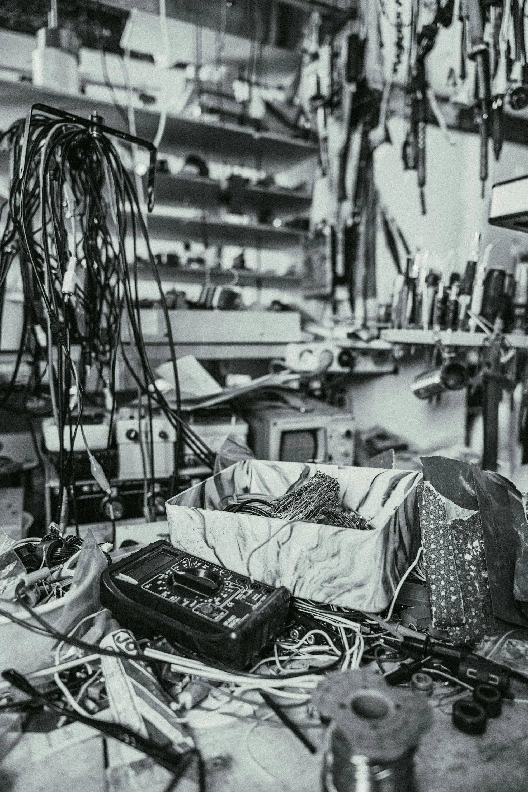
Controls also live among other things. A beautiful panel may be difficult to read when a cable hangs across its lower edge or when the object is placed below eye level. A control intended for frequent use needs an accessible position in the actual arrangement. Looking at the object in isolation can hide those ordinary complications. Set it among the things it will share a surface with and the layout begins to feel different.
The labels deserve the same practical scrutiny. They need to be readable from the position where someone stands or sits. A word that is familiar to the designer may be unfamiliar to the owner. A tiny symbol can save space while spending someone else’s time on interpretation. Sometimes the full word is the more generous use of a panel, even if it interrupts the visual rhythm.
The detail that remains familiar
Objects used often accumulate small habits around their controls. A hand reaches toward the same corner. A glance checks the same mark. Changing that arrangement gives the owner something new to learn, so a redesign should have a reason for moving familiar parts. Consistency can be a useful quality in itself when the previous arrangement already makes sense.
An unfamiliar object should still be allowed to teach its own particulars. Some things genuinely need unusual controls. The details around them can help explain the difference: a clear label, an obvious limit to a movement, or an indicator that stays close to the action. Novelty becomes easier to live with when the object gives enough information to approach it without hesitation.
I find myself appreciating these decisions in plain, uncelebrated objects. A dial readable from the chair can save a repeated movement toward the table. Put a switch where the hand can find it, and the object can stay in its place while being used. These details are modest, but you encounter them every time. Familiarity gives you plenty of opportunities to notice whether someone thought them through.